Thursday, December 30, 2010

A Look Back at 2010

It has been a long interesting year, but alas all good things most come to an end!


Here are some of the fun things we did together!
Alex Roman showed us what was possible with CG.  
We took a trip with Grzegorz Jonkarjty on a different kind of Ark.
The Freise Brothers showed us what happens when The Machine Stops. 
We found Picasso's lil'guitar!
We took a ride in one of Keven Cyr's creepy Vans.


We had a long night with Nuit Blanche.
We had a long "Look" at Sebastien Teller and Record Makers.
Juan Francisco Casas Ruiz taught us how to draw with a Bic.


Hip Hop and Architecture? Yes!
We explored the Artifacts of Ambition.


and Tom Harris took a much closer look at Concrete.

Thanks for a great year, here's to a great 2011!
Cheers
matt

Friday, December 24, 2010

50 Square Meters of Public Space

From the Czech group EPOS257 and experiment on human behavior that William Whyte would have been proud of.


From their page.
"The appropriation of public space with no apparent intent

Duration: 54 days (September 04 - October 27, 2010)

Location: Palackeho square, Prague - the so-called "Czech Hyde Park" - allegedly the most liberal spot in the country, approved by the authorities for holding any unannounced public gatherings.

Have we grown accustomed to having our living space curbed by just anyone? Is public space a mere myth?

In the current society, our living space is defined by legal norms and regulations, the same way as fences demark the choices of our free movement.

Only by attempting to cross those boundaries, we learn how limited the space we live in really is - that we are not as free as it may initially seem. We are getting the sense that the individuality of today is destined to an existence amidst restrictions."

Thursday, December 23, 2010

A Jet Traveling 560 mph would take...

... 1100 years to circumnavigate the surface of the largest known star.


How small we are.

Wednesday, December 22, 2010

The Evolution of Geek

If you read this blog you are probably one of these...

Tuesday, December 14, 2010

Black Swan

Apparently, Black Swan was shot on Super 16mm, ARRI, Canon 7D & 1D mark IV. The rehearsal footage was shot on the 5D Mark II.

While I haven't had a chance to see the film yet, I've heard fantastic things about it. I'm glad to see directors making a move to more "unorthodox" methods of recording footage.

More to come later!

Wednesday, December 8, 2010

Even More Super Models at MAM

In what is now a series of Vicrotia's Secret adverts, Michael Bay has a group of models climbing all over the Milwaukee Art Museum.

Thursday, December 2, 2010

Precast

I "had" to do some testing at work today of a 39 mega-pixel back we had repaired.  I set up the view camera and got to work on one of the precast concrete walls that sheath our building.  Upon looking at them in full resolution I began realizing that there were hundreds of micro compositions to be made within the single image; which makes a lot of sense considering you have 39,052,992 pixels to play with.  Here are a few for you to enjoy.

The original image.
Slices of that same image.


Click the images to see them at a higher resolution, which is a necessity to see every valley and ridge of the surface.

Friday, November 26, 2010

Sexy Architecture

Recently while occupying a space that had a TV that I was not paying attention to, I was instantly transfixed by the image of something very sexy.  Out side of the scantily clad super models, the newest Victoria's Secret Commercial, is just one more example why Architecture is THE sexiest profession.


Filmed in the Santiago Calatrava's Quadracci Pavilion, in Milwaukee, the advert features all of our favorite VS models "experiencing" the space while enjoying a Miesien Daybed, a Philippe Starck Ghost Chair, and Eero Saarinen's 1948 Womb chair.


Though not a huge Calatrava fan, having being in the space I can not deny it's wonderful experience.  In fact, I believe that the only thing that could make it better is if it was alway occupied by Victoria's Secret Models.


Thursday, November 18, 2010

Alex Roman at it again AKA The Best CGI You Have Ever Seen

I had to post this as soon as I saw it.

You may remember a few posts earlier this year about Alex Roman, the unreal CG artist that blew everyone away with the Third and the Seventh. This is a commercial Roman did recently.

If this does not make you feel at least a little bad about your rendering skills or a lot inspired to create something beautiful then you are not watching close enough.

Wednesday, November 17, 2010

What We're Looking At

First, we apologize for not posting as much as over the summer.  Despite the slow down in posts our readership has consistently grown over the last few months.  So we sorry and Thank You! We hope you like what you are seeing and reading.  There is so much more to come.


Not to give away the goose, I was thinking that I would do post of the blogs and creative resources that I personally follow and I know some of our other contributers follow.  Some image and video aggregaters and others are just plain interesting.  The blog roll on the side of this page is just a small sampling.  So, here we go.


http://www.talkvideotome.com/ (the video blog I contribute to)


http://bldgblog.blogspot.com
http://www.archinect.com
http://www.booooooom.com/
http://designcove.blogspot.com/
http://ffffound.com/
http://mediamilitia.com/
http://www.thecoolist.com/
http://designyoutrust.com/
http://www.notcot.com/
http://www.unstage.com/
http://everyroadarunway.blogspot.com/

Saturday, November 13, 2010

Fresh Meat

Just a quick plug.

Along with the Operable Window I am also involved with another blog/Publication. Fresh Meat is the school journal and blog for the School of Architecture at the University of Illinois, where I am a grad student.

My portion of the blog is called The Frame. I discuss perception, representation and documentation.

The Rest of the blog and web site is filled with writings and interviews by other students.

Add it to you reader and follow what is happening in the academic world of Architecture.


Monday, November 1, 2010

Sesame Street Does Old Spice

Because Sesame Street never stops being creative.

Friday, October 29, 2010

Latent City

I generally don't post in this fashion but ArchDaily did an excellent job of covering this project. Here is the video, but there is much more discussion and screenshots on ArchDaily.

Latent City / Yaohua Wang | ArchDaily

Tuesday, October 26, 2010

Rap and the City

...and now for something completely different

For all intensive purposes rap is considered to be the most 'urban' music.  This is not to say anything else besides the fact that it is almost always related to the urban environment, and addresses urban issues, some more serious then others.  At the most 'superficial' level artist often use the city for the complete theme of tracks.  That overarching theme is the purpose of this post.  Not to analyse or critique the competence or validity of individual artists, or the genre as a whole.

On this most basic level a lot can be learned about perceptions of what it means to be urban by understanding the art that is produced there.  In the past some rock artist have used the city as a back drops for songs, think 'House of the Rising Sun', but no genre, rock included, address the city in the same way that rap does.  I am not going to speculate exactly why this is as I am not a rapper and not a part of the rap scene by any means besides the fact that I listen to it.
What I can say is that at the least, this aspect of Rap is one of its most interesting traits.  Below are a few videos that address this issue.  From talking about city pride, discussions of crime, discussions of possibilities, to simply using the city as imagery to designate a place of belonging.  Take a look at these extremely diverse videos.  I can only imaging how some of the architects of the structures seen in these videos would react to their works being portrayed in this way.  At the least I would hope that they would be interested to know they are the symbols of these great cities. (NSFW)


and of course

Monday, October 25, 2010

Tobias Battenberg : Projected Typography


Tobias Battenberg set out with a projector and a selection of letters from the font, Akzidenz Grotesk, an inspiration for some of the more famous fonts such as Helvetica and Univers.


Tobias projected, from street level, letters upon buildings and pieces of infrastructure with some very beautiful results.  In projects such as these I would argue that the photographs of the process are as important a final result as the actual experience of being there.  Take that with a grain of salt as it happens to be coming from a photographer here.


Have a look at the project, though the description of the project is in German, using google chrome or a translator you can get a better idea of what he had in mind.

Tuesday, October 12, 2010

Felice Varini : Perspective Localized Paintings

A Swiss artist, Felice Varini has recently been brought to my attention.  I had seen his pieces in photograph form in the past and had never been given his name.  After looking through his website, which happens to be in french, and finding some great video showing dynamics of the project, I thought I should share it with you all here.


Take a look at this photo of a whole neighborhood he did here:


The video showing just how these work, seen by pedestrians and only clearly visible as a perfect whole from a single perspective.


Enjoy.

Friday, October 8, 2010

Hybrid Creatures

Using conventional photography and creative photoshoping, Francesco Sambo has been able to create an interestingly strange array of creatures.


Though each different, they all convey a similar emotional feel to the viewer while retaining a strong animalistic quality. Each has a unique personality and I feel that the poses from image to image fit each animal to a 'T'.

Take a look at the rest of his creations here!

Tuesday, October 5, 2010

Only in the City

Slightly keeping with the theme from The Kids are Alright post.

A fellow UWM Arch Alum produced this beautiful film chronicling urban spaces in Chicago this summer.  It is a beautiful example of all of the things that you can only see in the city.

From the crowded city beach, the crowds welcoming a winning team (Blackhawks Stanely Cup Parade in the opening sequence), to little kids playing in Crown Fountain (00:47) there is one thing that permeates what it means to be urban, People.
Full Screen This.


Chicago from jv on Vimeo.

Thursday, September 30, 2010

The Kids are Alright

This video was brought to my attention recently.  It is an interesting look into the lives of the young adults of Chicago. very well made.

My Life Chicago from Kyle Neary on Vimeo.


Concrete-Production
Video-Josh Robinson


"The life style and the people that I came across of my visit to Chicago, their story...."

Tuesday, September 28, 2010

Deviant Art Overview

Now that a few images have come up from my series of favorite Deviant Art artists, I would like to take a second to talk about why I think that these pieces have value.

So far the images that I have chosen are all portraits.  They are all different in their own ways, compositionally, chromatically, and so forth.  What they do all possess though is a certain rigor.  The do not have the effect of being overly photoshopped (though they may have an extensive amount of work done to them).  The do have en extreme attention paid to detail and to focus.  In this I am mean (outside of effects such as sepia, vignetting, color correction) the attention to the fine details of the face, the position of the subject, and the composition.  Notice all of their attention to skin, and to hair, to expression.  The shots seem effortless.  These are the reasons I love these shots.  This is also what am always striving to do in my own work.  I attempt this in every shot that I take, whether it be in Architectural , portrait, or candid photography.  I do not often share my personal work on this blog, but I will share a few of my images here to show what I mean.  I hope that you can see in them what I am attempting.


Monday, September 27, 2010

Tuesday, September 21, 2010

Light Rhapsody

Absolutely beautiful and inspiring short.  Think the opening sequence to Goldfinger revamped.  


From the Artists-


"Hi,
We are two young french directors that decided to create a real time installation and make a video from it.

"Light Rhapsody" is a real time human lighting sculpture. A 3D model has been projected in real time over the real model through a projecting device. It creates a radiant dissemination emanating from her skin.That projection was animated and progress over her entire body until it has reached and invaded her face.

2 days shooting with the model (thanks to you Julia Nana for your patience) and another one for the wild shot of NYC.

We shot with two cameras, a D90 and a 1Dmk4 cause the budget was super tight.

We would like to make some special thanks to our model, Julia Swell and our talented make up artist Cindy Leroux. Thanks to Hsiao-han Lan 筱涵 our magic set photographer !!!

Marc & Vivien"


Give it justice with full screen.

Light Rhapsody from Vivien TESTARD on Vimeo.

3D Light Painting with iPad

Out of London- The first interesting use for an iPad discovered!


Berg and Dentsu London have used 3D modeling, a "homebrew" app, long exposure and time lapse to produce a truly beautiful effect.


I love how analog this is.  It would be very easy to make a similar effect without half of the work, but it would just be similar, not as amazing.


Making Future Magic: iPad light painting from Dentsu London on Vimeo.

Thursday, September 2, 2010

DeviantArt- mehmet turgut

This is something I think I am going to turn into a new series on this Blog.  I will be taking "random" images from my DeviantArt Favorites folder and putting them up here with a link to the artist page.  I am not particularly active on DA anymore, but I still browse it regularly for inspiration.

act of insanity . . . . VIIby `mehmeturgut


Tuesday, August 31, 2010

Silent Star Wars

George Lucas meet Fritz Lang...

Monday, August 23, 2010

The Case for Knock-Offs

I find myself in a conundrum.  I love design,  I love designers, I love designer things, but, alas, I the first two of these list are the only ones that I have the means to have around.  I can design and look at design and I can surround myself with other designers, but I can not afford the things I see or those that are produced by the same designers.

So here I am.  Recently I ordered a new chair for my desk.  I had the option of buying something from Target or Ikea (often, both good options), I could buy a real designer chair from Design Within Reach for around $500 or I could buy a knock-off.  In my mind, my knock-off choice was pretty easy.  Room and Board had an Arne Jacobsen Series 7 knock off that was very nice.  They call it the Jake Chair.  This ended up being my final decision.


This is not the only piece of knock-off furniture that I have in my home.  In the living room I have the Eames Lounge knock-off that was in the living room of the house I grew up in.  Outside of that chair being extremely comfortable, it also holds a lot of emotional value to me.  It is actual one of the few objects I own that does have that kind of sentiment attached to it.  Our kitchen also has a handful of knock-off Saarinen Tulip Chairs and a matching table.  


I also have a Hiroshige poster in my room, not a real priceless woodblock print stolen from the Art Institute.  

So what does this all mean?  I often ask my fellow designers what they think of the situation.  They, as I do, often have mixed feelings.  They feel the same want to have beautiful well designed objects in their life, but don't have the money.  Some say it is better to save up to have just one real piece.  Others say buy the knock-off and then someday upgrade (this is my plan).

Knock-offs are essentially stolen ideas.  I do on the other hand differentiate between Knock-off and Replicas.  Replicas actually being copies meant to look exactly the same.  I apologize for not having a more conclusive opinion the the subject.  I just needed to write something about it.


Sunday, August 22, 2010

Two Weeks in the Life (An Architecture Tale) HD

Two weeks ago I started an intensive summer program at the University of Illinois Chicago.  The program was for students starting the Three Year Masters of Architecture program.  Throughout the two weeks I had my camera running snapping photos every 15 seconds.  This is not a complete two weeks of time lapse, but an edited video of some of the intensive work that goes into Architecture school.  Notice how much the sun moves as people are glued to their desks.

Enjoy!

COMUNE Jeans

Another Product Spot!?

Well I felt compelled to write about another purchase I made yesterday.  In my search for a new pair of Headphones, and a look through some clearance racks I found two pairs of COMUNE jeans marked down from $68 to $9.99!  So finding my size I tried them on.  Winners!  On even closer inspection I found that every detail of these jeans was carefully attended to.  From the triple stitched seams, and the button choice, to the unique branding and labeling.  These are my first pair of raw denim jeans, meaning they were not washed in the production process after dyeing.  The idea being that they will soften and fade over time depending on the body and activity of the wearer giving a more natural fade.  I am not overly familiar with all of the fashion terms used to describe clothing in real detail so I digress.   What I do want to talk about is the labeling of the jeans.  Attached to the back pocket is a fabric tag that marks the size, company name and a short mission statement reading...

"FUNCTION
COMUNE was formed from the idea that there will always be people out there who not only embrace the rawness and imperfections of everyday life but use it to creatively push the boundaries of what's possible in skateboarding, fashion, art and music their own way, with complete disregard of the consequences.


PURPOSE
Our goal is to provide clothing that reflects this lifestyle of carefree idealism and to support the people that choose to live it."


Interesting!

Also attached to the string was a sealed packet that contained a set of six negatives that had images and measurements of the different cuts that the company offers.  Along with the negatives in the packet was a rubber "card" with the company name.  It seems to be the as the rubber waist band label on the jeans themselves, and it sticks to a mirror nicely.  Thankfully I have a lightbox that allowed me to check out the negatives a little more carefully and get some photos of them to share!


I rarely have the means to buy clothing of this craftsmanship, but I do see the appeal.  There is much equity in the thought and work that goes into clothing sometimes, and I believe that can be rewarding for the maker, and patron. 

Saturday, August 21, 2010

Urbanears Plattan Headphones Unboxing

Here is something a little different fro the Operable Window.

In need of a new pair of headphones I found myself shopping around a little bit today.  I knew that I wanted a good looking pair as these would be my "wear on the train to school" pair.  They needed to be something of an accessory as well as a functioning tool.  I am no Audiophile, I mostly listen to MP3s and internet radio/podcasts.  I did not want ear buds again as I find them uncomfortable and they are not so good for your hearing.  So I was willing to spend a little bit of money for something I was going to use everyday but not looking to break the bank.

This is not going to be a review as I have only had the headphones for a matter of minutes and am listening to them for the first time right now.

I ended up settling on a purple set made by the Scandinavian company Urbanears.

From their website and the included booklet-


"Urbanears is a collective out of Scandinavia, motivated by a common interest in global relationships and shared involvement in the relevance of the living brand. Urbanears promotes a deeper connection to color, form and people while providing the freedom to transcend individuality and unify the sound experience."


Sounds pretty sweet to me.  The specific pair I purchased were the Plattan 
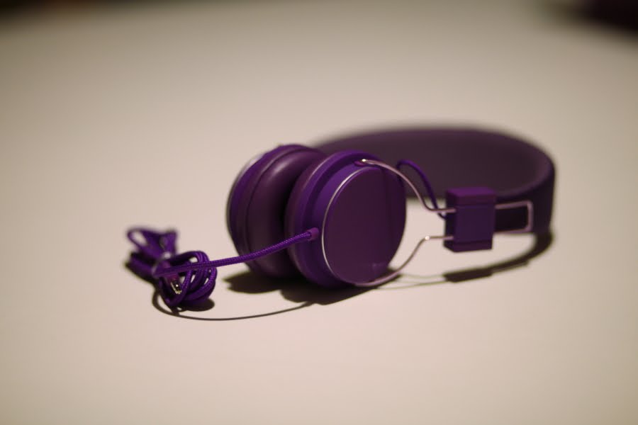
model.  They come in a staggering 14 color options.  The Urban Outfitters that I purchased them from had them in four colors, Gray, Ocean, Purple and Red.  

Purple just seemed right to me.  As you can see below the boxing, branding and presentation of the product is absolutely beautiful.  The package included the headphones, two extensions for non-standard jacks, and a beautiful booklet with pictures of all of the other colors.

Some cool features of the headphones include a mic and phone answering button on the cord so you can use it with your phone, something called a "zound plug" which is another small jack that a friend can piggy back off of your headphones with their own to share music, the cord it self is breaded fabric, and all of the metal parts are purple anodized for a little extra pop.  I love this attention to detail.

Not too much else to say about it.  I just thought everyone would like to see this cool packaging and I am sure anyone that knows me will see me around Chicago with these bad boys on.


Thursday, August 19, 2010

Papercuts by Bovey Lee

Love, Love, Love, what can be done with paper.


Papercuts by Bovey Lee via Unstage

Wednesday, August 11, 2010

The Artifacts of Ambition

Our physical built world is a result of the efforts and egos of countless individuals. Unfortunately, these built "things" often have very little capacity to convey the meaning and intention with which they were originally conceived. When pieces of our built environment disappear the ability for us to understand them becomes even more limited. They become an ever fading entry in collective and individual memory. On a recent trip, I had the opportunity to uncover lost ambition both in two very different places.

A few weeks ago, I made my way to visit with some friends. I had just left an apartment searching adventure in Boston and was ready to relax and enjoy my time with some familiar faces. One of the highlights of my stay was my visit to the The Skyscraper Museum. Located near the battery on the tip of Manhattan, the museum chronicles the history of perhaps the most recognizable building type ever conceived. The space itself is quite modest, but the curators had cleverly mirrored the entire ceiling as a tongue-in-cheek nod to the buildings to which is is devoted to display. The current exhibits focused on the development of Wall Street and the rise of super tall buildings in southeast Asia.

My favorite exhibit detailed extensive history of the World Trade Center towers. Seeing original hand sketches, correspondences, and models brought a human scale to these buildings that I had never before felt. I didn't get the opportunity to see the original towers in person, but the stories of the people who made such a cutting edge building possible made the buildings seem very real.

image: pbs.org

Of particular interest was a 7 page typed letter written by Minoru Yamasaki in response to a nasty review by Ada Louise Huxtable in the New York times. It encompasses the courage and conviction that it took to make these buildings a reality. If you can't get to the museum, you can check out a digital version here.

image: http://www.skyscraper.org/

It also includes a fascinating archive of the Empire State Building. Not too bad.

After New York, I made my way to southwest Wisconsin to visit some family. A trip out to dinner brought us to a very remote part of the county. I was told that all of the residents of this area had been displaced by a large flood control project during the 1970's that was never completed. Indeed, the State bought the property from hundreds of residents in the late 60's in their efforts to construct a dam outside of La Farge, Wisconsin. Flooding from the Kickapoo River had routinely devastated the small farm towns that lined its banks. The dam, designed by the Army Corps of Engineers St. Paul branch, was meant to eliminated the periodic flooding and create a reservoir for recreational use. Early renderings [as the so often do] depicted a pleasant scene of sailboaters and rolling hills.

image: Kickapoo Valley Reserve

The project was canceled in 1975 amid pressure from local environmental groups and the newly formed EPA, but not before a large portion of the project was actually completed. The landscape remains eerily deserted to this day, but is embedded with the remnants of this failed project. The dam itself seems to be of the earth-filled, concreted lined type and stretches halfway across the river valley before it slumps back in to the ground. The bluff on the left side of photo seems to be stripped to bare rock and ready to receive the completed section of the dam. The spillway channel and tower are largely completed as well. The Kickapoo River doesn't really seem to mind though.

image: wikimedia commons

The intake tower stands in tall grass of the valley floor and remains in pretty good shape. This blocky outpost looks misplaced without its watery veil, and now takes on a new role as a sort of sentinel in the landscape. An excerpt from the photographer's website tells of a sort of transient transformation into a playground.
This tower represents the most amazing childhood adventures I can remember. My family owned property adjoining thousands of acres of government property that was purchased for the purpose of building a dam. Well funding fell through, and all that was built was this tower, a tunnel. One day we ventured onto the property only to find that the oval metal door at the base of the tower had been broken into. Of course, being red blooded boys...we had to explore the tower. I won't go into every detail, but I can tell you that I opened and looked out of that door you see near the top. The door with no platform. We also stood on the very top of it.
photo: flikr.com, uberphot

However, not all remnants of the project exist as half-finished leftovers. The State realigned highways that passed within the area of the future reservoir up to a new home up on the bluffs that overlooked the river. The original roads remained as access roads for construction crews that would be flooded over once construction of the dam was complete. Those roads remain to this day, still with their head above the water line and meandering along the bottom of the river valley. This google map shows the location of the dam in relationship to La Farge as well as the network of original and realigned roads.

image: WisconsinHighways.org

Although they have become part of the past, the artifacts of these objects still manifest themselves in images, oral traditions and physical remnants. They are still important, but why? Collective memory can be frighteningly short, and the world around us can easily be looked at with a sort of temporal permanence. The physical reality of today was that of yesterday, and will continue to be such in the future. In a way, the role of museums is to refresh the collective memory, and uncover a timeline that often gets destroyed. One artifact is displayed in a Lower Manhattan museum, the other left to lay in rural Wisconsin countryside. How will these things be kept alive so others can understand the ambition that made them a reality in the first place?